Tired of deciphering cryptic spreadsheets and wrestling with endless filters to extract basic insights from your data? If so, you’re not alone.
Traditional data visualization tools often leave us feeling overwhelmed and underwhelmed. But fear not- there’s a better way forward.
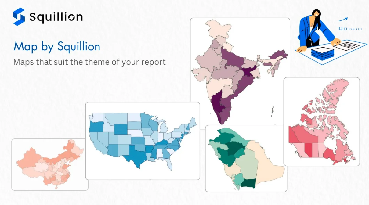
Imagine effortlessly transforming your data into captivating maps that instantly reveal hidden patterns and trends. With Map by Squillion, that’s exactly what you get – a no-code data visualization tool tailored specifically for map magic.
Introducing Map by Squillion
The revolutionary tool that turns map-making into a walk in the park (or, well, a stroll through the data park!).
Forget complex coding – this no-code hero lets you visualize your geographic data with stunning results, even if you’re more comfortable with spreadsheets than scripts.
Available on Microsoft AppSource for free download, Map by Squillion seamlessly integrates with Power BI, making it the perfect sidekick for your data analysis adventures.
Whether you are a seasoned data pro or a curious newbie, this tool empowers you to create captivating, interactive maps that bring your insights to life.
But what exactly is Map by Squillion?
Simply put, it’s your passport to unlocking the hidden potential of your data. It’s a way to:
- Visualize geographic data effortlessly: Ditch the code and drag-and-drop your way to stunning maps, even if you’re a spreadsheet wizard, not a coding guru.
- Gain actionable insights, not just eye candy: Go beyond aesthetics and uncover the “why” behind the “where”. Track sales trends, analyze customer demographics or map campaign reach – all with clear, actionable insights.
- Supercharge your Power BI: Take your existing data analysis skills to the next level by adding a powerful geographic dimension to your stories. There is no need to learn new software; unlock the map magic within your familiar environment.
Dive into a world of rich features of Map by Squillion
Look at the features in detail to understand what superpowers you can achieve and brainstorm your next plan of action with detailed geographical data representation:
1. Paint a Picture Perfect Report
Forget clashing colors and mismatched themes. Map by Squillion’s customizable color and formatting options let you tailor your map to blend seamlessly with your brand or report design. Create visually stunning reports that impress and inform in equal measure.
2. Office-Ready Polish
This is different from your average bar chart. Map by Squillion’s visuals are crafted with professionalism in mind, making them the perfect addition to any boardroom presentation or business report.
They add a touch of sophistication and clarity, elevating your data storytelling to new heights.
3. Immerse Yourself in the Data
Experience the magic of 3D-like hovering that takes your map to the next level. As you explore, data points come alive, adding depth and dimension to your visualization.
It’s not just a map; it’s an interactive journey that engages your audience and sparks curiosity.
4. Click and Discover Hidden Insights
Refrain from settling for static visuals. Map by Squillion empowers your audience to participate actively in data exploration.
With interactive click functionality, users can drill down into specific regions, filter information, and uncover hidden insights. The tool’s data analysis is intuitive and engaging.
What Makes Map by Squillion Adequate Over Other Data Visualization Tools?
Unlike other free map data visualization tools, Map by Squillion offers a level of customization and interactivity that can transform your data into a compelling narrative.
1. Unveiling Hidden Gems: Insights that Ignite Action
Map by Squillion goes beyond the flat table, letting you visualize data geographically through intuitive maps.
Use colors to identify hotspots and cold spots for sales, customer demographics, or campaign reach. See emerging trends across regions and drill down to specific areas for deeper analysis.
Practical Implementation:
A retail chain uses Map by Squillion to visualize sales data by region. They color code each region based on sales performance – green for high sales, yellow for moderate sales, and red for low sales.
This allows them to quickly identify regions with lagging performance and target marketing campaigns in those specific areas, leading to a 30% increase in sales within three months.
2. From Static Reports to Storytelling Maps
Captivate your audience with dynamic, interactive maps that tell a compelling story. Ditch static visuals and replace them with immersive experiences.
Use 3D-like hovering to reveal data details on specific locations and empower viewers to interact with the map by filtering and clicking for deeper exploration.
Practical Implementation:
A real estate company showcases new developments on an interactive map. Potential buyers can explore neighborhoods, visualize amenities, and filter by specific criteria, leading to faster sales and happier clients.
3. Seamless Integration, Effortless Impact
Don’t worry about disrupting your existing workflow. Map by Squillion plays nicely with your favorite tools, like Power BI, for a smooth transition and immediate impact.
Leverage its customizable options and office-ready design to create stunning reports that seamlessly integrate with your brand and existing style.
Practical Implementation:
A city government uses Map by Squillion to visualize public transportation usage. Different colored lines represent different bus routes, with thicker lines indicating higher passenger volume.
This allows them to identify areas with high demand and optimize bus routes to improve efficiency and service for residents.
Download Maps by Squillon from Microsoft App Source
Don’t let complex data visualization challenges slow you down. Download Map by Squillion today from Microsoft AppSource and start transforming your data into engaging, insightful maps that drive decision-making.
Experience the power of professional-grade map visualization at your fingertips and take the first step toward unlocking the full potential of your data.