Are you aware that visuals are processed by our brains at a speed that’s a whopping 60,000 times faster than plain text? In our data-saturated world, making sense of information can be daunting. Enter data visualization. Imagine viewing your business metrics, from sales to feedback, on one interactive dashboard. It’s not just a dream; businesses worldwide are realizing this through data visualization.
This post delves into the importance of data visualization and explores why data visualization is important for modern businesses. If complex data has ever baffled you, stay with us. We’re unveiling a way to simplify and harness its power.
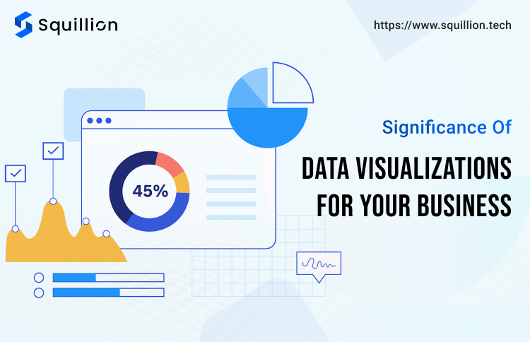
What is the Importance of Data Visualization?
Data visualization isn’t just about creating charts or graphs; it’s about presenting data in a way that’s intuitive and actionable. With the sheer volume of data businesses handle daily, quick and clear interpretation is crucial.
Data visualization allows companies to see patterns, trends, and outliers in seconds, which would otherwise take hours to analyze in raw form. This immediate understanding can lead to faster decision-making, identification of business opportunities, and prompt detection of any issues or anomalies.
By visualizing data, it becomes comprehensible for every team member, even those without a technical background. This fosters a collaborative environment where everyone can contribute to informed decision-making.
Purpose of Data Visualization
The main goal of data visualization is to make understanding intricate data straightforward and clear. With the myriad of data visualization tools available today, businesses can convert raw, unstructured data into structured visuals.
These visuals don’t just tell a story; they present it in a number-liciously understandable way!
Consider this: A spreadsheet filled with numbers can be daunting and time-consuming to analyze. But when the same data is presented visually using data visualization examples, such as charts or graphs, trends and patterns emerge instantly. Tools like Tableau data visualization and data visualization with Power BI have revolutionized the way businesses view data, making it more accessible and actionable.
Furthermore, data visualization’s importance cannot be overstated in today’s competitive business environment. It’s not just about understanding data; it’s about leveraging it to drive business strategies, make informed decisions, and gain a competitive edge. When data is presented visually, it becomes easier to grasp the strengths, weaknesses, opportunities, and challenges of your business.
Different Types of Data Visualizations
In the realm of data analysis, how you present your data can be just as crucial as the data itself. Appropriate visual representation can transform intricate data into understandable, insightful, and actionable information. Let’s explore some of the most common types of data visualizations and when to use them:
Charts
- Bar Chart: Ideal for comparing quantities of different categories. It’s especially useful when you want to show the differences between quantities in a clear and straightforward manner.
- Pie Chart: Best for visualizing a whole unit and the proportion of its components. It’s a classic choice for showing percentage or proportional data.
- Line Chart: Perfect for visualizing data trends over intervals like months, years, or days. It’s commonly used in financial analyses.
Graphs
- Histogram: A representation of the distribution of a dataset. It’s an estimate of the probability distribution of a continuous variable.
- Scatter Plot: Displays values for two variables from a set of data. It’s used to determine relationships or correlations between the two variables.
Maps
- Heat Map: Represents complex data sets using colors in two dimensions. It’s a great way to visualize variations across a geographical area or represent user activity on a website.
- Choropleth Map: Uses different shades or patterns in predefined areas to indicate the value of a variable in that area. It’s commonly used to represent demographic data like population density.
Infographics: A visual representation of information or data. Infographics combine charts, graphs, images, and text to tell a story or present information cohesively and engagingly. They’re excellent for marketing campaigns or any scenario where you want to explain complex information quickly and clearly.
Tree Diagrams: Useful for hierarchical or branching information, like organizational structures or website sitemaps.
Box Plots: Provide a bird’s-eye view of the distribution of a dataset, highlighting the mean, quartiles, and potential outliers.
Who Uses Data Visualization?
Data visualization is the universal language of the business world, acting as a bridge that connects raw data to actionable insights. It’s not merely about crafting pretty charts; it’s an indispensable tool that various departments within a business harness to make informed decisions. Let’s delve into how different sectors utilize this powerful medium.
Marketing Teams:
- Purpose: To gauge the effectiveness and reach of various marketing campaigns.
- Usage: By employing data visualization, marketing teams can get a clearer picture of metrics such as engagement rates, conversion rates, and ROI. This visual representation helps pinpoint which campaigns resonate with the audience and which strategies need tweaking.
Finance Departments:
- Purpose: To anticipate financial trajectories and dissect various revenue channels.
- Usage: With the aid of visualization tools, finance professionals can forecast potential market shifts, make informed decisions about budget allocations, and devise sound investment strategies, ensuring the company’s financial health.
Human Resources (HR):
- Purpose: To evaluate employee performance, satisfaction levels, and overall team dynamics.
- Usage: HR teams utilize data visualization to monitor key performance indicators, establish growth benchmarks, and pinpoint areas where training or development might be required, ensuring a harmonious and productive work environment.
Logistics and Supply Chain Teams:
- Purpose: To oversee inventory levels and ensure the smooth transit of goods.
- Usage: Through visualization, these teams can anticipate product demand, guarantee timely deliveries, and ensure that stock levels are maintained optimally, reducing wastage and inefficiencies.
Sales Teams:
- Purpose: To gain insights into customer behavior and monitor sales-related metrics.
- Usage: By visualizing sales data, teams can forecast upcoming sales trends, pinpoint potential leads, and devise strategies for effective customer engagement, ensuring steady revenue streams.
Product Development Teams:
- Purpose: To collate user feedback and steer the direction of product enhancements.
- Usage: These teams rely on data visualization to grasp product usage trends, collect and analyze user feedback, and decide on feature developments, ensuring the product evolves in line with user expectations and market demands.
Famous Data Visualization Tools
In today’s data-centric world, having the right tools to visualize and interpret data is paramount. The digital marketplace is brimming with some of the best data visualization tools, each bringing its unique flair to the table:
- Tableau: Often hailed as the gold standard in data visualization, Tableau is renowned for its user-friendly interface. It empowers even those without a technical background to dive deep into analytics, making data-driven decisions accessible to all.
- Power BI: A product of Microsoft, Power BI is celebrated for its robust integration capabilities. Whether it’s Excel spreadsheets, cloud-based or on-premises data sources, Power BI ensures a smooth data flow, making real-time analytics a breeze.
- D3.js: For those seeking granular control over their visualizations, D3.js is a godsend. It’s a JavaScript library offers unmatched customization options, allowing businesses to design unique, interactive data visualizations that truly resonate with their audience.
- Google Data Studio: Google offers a complimentary tool that enables users to craft dashboards and reports that are user-friendly, shareable, and highly customizable. It integrates seamlessly with other Google products, making it a favorite for many businesses.
- Looker: A modern platform that offers powerful exploration capabilities. With Looker, businesses can dig deeper into their data, uncovering insights that might have been overlooked with other tools.
Advantages of Data Visualization Tools
In the age of information, data visualization tools are the compasses that guide businesses through the vast ocean of data. They’re not just software; they’re game-changers. Here are some of the standout advantages:
- Enhanced Decision Making: By showcasing data visually, these instruments simplify the process for decision-makers to identify patterns, shifts, and irregularities. This leads to quicker, more informed decisions without sifting through endless spreadsheets.
- Collaborative Environment: Modern data visualization tools promote teamwork. With shared dashboards and simultaneous access, teams can collaborate in real time, ensuring everyone is on the same page.
- Predictive Power: With advanced analytics capabilities, these tools don’t just show what’s happened; they predict what’s next. Businesses can forecast sales, market trends, and even potential risks, ensuring proactive strategies.
- AI and Machine Learning: The integration of AI and machine learning algorithms takes data analysis to the next level. These tools can now provide recommendations, automate repetitive tasks, and even detect subtle market changes that might go unnoticed by the human eye.
- Increased Engagement: Interactive dashboards and visually appealing reports ensure stakeholders at all levels engage with the data. When data is interesting and accessible, it’s more likely to be used effectively.
- Cost Efficiency: Through the automation of data evaluation and reporting mechanisms, companies can conserve considerable amounts of time and assets. This efficiency translates to cost savings in the long run.
Different Scenarios for Utilizing Data Visualization
The beauty of data visualization lies in its versatility. Regardless of the industry or challenge at hand, it offers a lens to view and interpret data effectively. Here are some scenarios where data visualization plays a pivotal role:
- Healthcare: Hospitals and clinics utilize data visualization to track patient outcomes, manage resources, and predict disease outbreaks. Displaying patient information visually enables healthcare experts to make better choices regarding treatment strategies and patient care.
- Finance: Financial institutions leverage visualization to monitor market trends, assess risks, and predict future financial scenarios. It aids in portfolio management, allowing investors to see the performance of various assets at a glance.
- Retail: Retailers use data visualization to understand customer preferences, optimize inventory levels, and forecast sales. By visualizing sales data, they can identify which products are popular and which aren’t, helping inventory management.
- Real Estate: Real estate agencies employ visualization tools to analyze property values, market demand, and demographic data. This aids in pricing strategies and identifying potential growth areas.
- Education: Educational institutions harness data visualization to track student performance, manage resources, and predict enrollment numbers. It aids in curriculum planning and helps identify students who might need additional support.
- Manufacturing: Manufacturers utilize data visualization to monitor production processes, manage supply chains, and predict equipment failures. It aids in quality control and ensures optimal utilization of resources.
- Entertainment: Streaming platforms and entertainment companies use visualization to understand viewer preferences, optimize content recommendations, and predict trends. It helps in content planning and marketing strategies.
From Data to Decisions: A Closing Perspective
In the vast realm of business, understanding data is pivotal. We’ve delved into the significance of data visualization, its varied applications across sectors, and the tools that make it all possible. To put it simply, data visualization is the bridge that turns complex data into actionable insights, ensuring businesses stay ahead in this competitive landscape.
Have you experienced its transformative power in your business?
If you’re looking to elevate your data game, Squillion Tech is here to assist. Dive into our data visualization services, and let’s craft a data-driven narrative for your business. After all, in the words of Edward Tufte, “There is no such thing as information overload, just bad design.” Let’s design better together.